Why a Public Square Needs More Than Open Ground
A public square works better when its edges, walking routes, and places to pause serve different needs without forcing people to choose between passing through and staying.
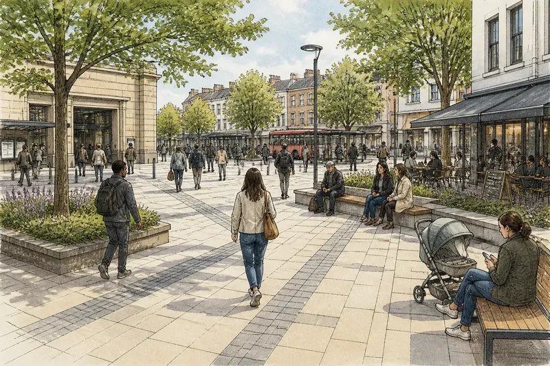
To make a public square useful for both passing through and spending time, start by watching where people enter, cross, and pause. A broad patch of paving can look open on a plan yet feel awkward on foot: people may cut across it quickly, hug its edges, or avoid it altogether. The practical question is how to arrange the square so movement has a clear path and staying has a comfortable place.
Work from what people already do, then decide which routes need clarity, where pauses can fit, and what the edges should offer. Treat the plan like a doormat beside a doorway: it can welcome people without blocking the way in. The sequence below is for shaping a proposal or discussing an existing square, not carrying out construction.
What is already happening in the square?
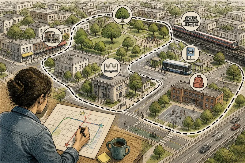
Visit at different parts of the day and observe from a public spot. Note where people enter, which destinations they appear to be walking toward, where they change direction, and where they stop. Keep observations general rather than identifying individuals. A simple paper plan or printed map is enough to mark patterns.
Look for more than the obvious desire line. People may skirt a planted bed, cross toward a bus stop, pause near a shopfront, or use a sheltered edge while waiting for someone. Notice whether a route becomes uncomfortable near a delivery entrance, a busy curb, or a patch with little shade. These clues help distinguish a design problem from a preference that can be accommodated.
- Mark each entrance and the destinations people commonly reach from it.
- Draw the paths people use, including informal diagonal crossings.
- Record stopping places and what seems to support them, such as a low wall, a view, or shelter.
- Note places that people bypass, along with visible reasons such as vehicle conflict or an exposed, narrow passage.
- Check how the pattern changes with weather, scheduled activities, and nearby service hours.
Do not treat one visit as the whole story. If an event, maintenance closure, or unusually quiet period is shaping what you see, note it and return at a more ordinary time. The goal is a grounded picture of use, not a claim that every visitor behaves the same way.
Which routes need to stay clear?
Next, separate necessary movement from movement that can comfortably share space. Start with connections between entrances, transit stops, nearby streets, public buildings, and other everyday destinations. Ask whether people can follow a legible route without weaving through furniture, queues, or activities.
Show those connections on a plan before placing seating or event space. A route can be defined by paving, a change in planting, lighting, or a line of furnishings set beside it. It does not always need to be fenced off. What matters is that walkers can read where to go and that a gathering does not regularly spill into the path.
Consider access as part of the route, not a later adjustment. A proposed path should make sense for people using mobility devices, pushing strollers, carrying bags, or walking at a slower pace. Avoid relying on narrow gaps between chairs or on a detour behind a temporary stall. For technical access requirements, consult the applicable accessibility rules and a qualified design professional.
Where several routes meet, give people room to see one another and choose a direction. If a crossing feels confusing on the plan, a few arrows or colored lines can help a project team discuss it before any design is settled.
Where can people pause without blocking others?
Once the main movement lines are clear, look for places where stopping feels natural. A pause might be brief—checking a phone, waiting for a companion, or watching activity—or longer, such as sitting down to eat. Different pauses call for different settings, so a square need not depend on one row of benches to serve everyone.
Consider several kinds of places to stop: a bench facing activity, a seat along a quieter edge, a broad step or ledge where appropriate, and an open area that can host a temporary gathering. Include options with shade or shelter where the site allows. Keep some seating beside, rather than inside, the clearest walking routes.
Look at the relationship between a seat and its surroundings. A person may want to face a fountain, a busy walkway, or a quieter planting bed. A companion may need room beside them for a wheelchair or stroller. The plan should offer meaningful choices without making any one place feel like the only acceptable place to sit.
Imagine a square where commuters cut diagonally between a station entrance and a bus stop, while a few people wait beside a shopfront. A draft proposal puts a long bench across their crossing. If the designer moves the bench to the edge of the waiting area and marks a clear diagonal route, the expected result is that walkers have a readable passage while people waiting gain a place to sit. This is an invented situation, not a report of a real project.
What should the edges contribute?
Edges often determine whether an open space feels inviting or exposed. Walk its perimeter and note what faces the square: shop doors, blank walls, building entrances, a street, planting, or a service area. Ask what people can do there and whether those activities support the square without taking over its central space.
An active edge might offer a doorway, a café window, a public building entrance, or a place to sit near a well-used path. A quieter edge can still be useful if it offers shade, shelter, a view, or a comfortable route. The aim is not to make every side busy; it is to give each side a reason to be part of the square.
Pay attention to transitions. A low planter, a change in paving, or a seating ledge can suggest where a gathering belongs while leaving the space open. A solid barrier can create a sharper division, so ask whether it is necessary for the intended use. Avoid adding objects simply to fill a bare edge; each one should support access, comfort, or a clear activity.
Also check whether the edge leaves room for everyday operations, such as deliveries, cleaning, or access to building doors. A square that works during a quiet hour but blocks routine use can create friction for both visitors and neighboring occupants.
How can the plan support different kinds of use?
Test the arrangement on paper against ordinary situations, not just a festival or a sunny afternoon. Trace a walking route while imagining a seated visitor, a small group talking, a person arriving with a stroller, and a maintenance worker moving through. If each imagined use depends on the same patch of ground, the plan may need clearer zones or more flexible furnishings.
Keep the central area adaptable if the square needs to host occasional gatherings, but do not assume that empty ground is useful by itself. A flexible center works best when people can reach it easily and nearby edges offer places to watch, rest, or meet. Think about where a temporary activity could go without making the ordinary route disappear.
Where chairs or movable tables are proposed, consider who will arrange and care for them, and where they can be stored. Fixed benches may be easier to keep in place, while movable seating can offer more choice but may drift into routes. The right arrangement depends on local use and the capacity to manage the space.
Invite people who use the square to respond to a clear plan, not just a broad question about whether they like it. Ask them to trace a route, point to a comfortable waiting place, or identify where a group activity might fit. Their specific comments can reveal whether the proposed edges and pauses match real routines.
Which questions help check the layout?
How do I tell whether a route is clear?
Trace it from entrance to destination and look for places where a person must cross a seating area, queue, or activity to continue. If the route is hard to follow on the plan, simplify its line or make its boundaries easier to read.
Where should seating go in a public square?
Place seats where people can pause without interrupting the main paths, and offer more than one kind of outlook or degree of activity. Check that the arrangement also leaves room for companions and for people who use mobility devices.
Does every edge need active uses?
No. An edge can serve the square through shelter, shade, a comfortable view, or a quiet place to sit rather than constant activity. Match each edge to its surroundings and avoid forcing the same use around the full perimeter.
How can a square stay flexible for events?
Keep a usable area open while placing everyday seating and routes where they do not depend on event setup. Then consider where temporary equipment, queues, and spectators could go without blocking normal access.
What should you revise before sharing the proposal?
Return to the plan and check each route, pause, and edge against the observations you recorded. Remove or move elements that create a conflict, and explain the purpose of the ones that remain. A useful proposal shows not only what will be added but also how someone can cross the square, stop briefly, and spend longer there without competing for the same narrow strip.
Before presenting it, make the drawing easy to read. Use distinct lines for walking routes, shaded areas for places to pause, and clear labels for entrances and neighboring destinations. Add a short note about what the plan still needs to resolve, such as an access question or a conflict with deliveries. That honesty gives reviewers a concrete point to address.
The central test for a public square is simple: can a person understand where to go, find a place to stop, and share the space without either activity pushing the other aside? A plan that answers those questions gives open ground a purpose. For anyone searching how to design a public square, the most useful next move is to revisit the site with the drawing in hand and see whether its routes, pauses, and edges fit what people actually need.